

The New Pepsi Logo Sucks
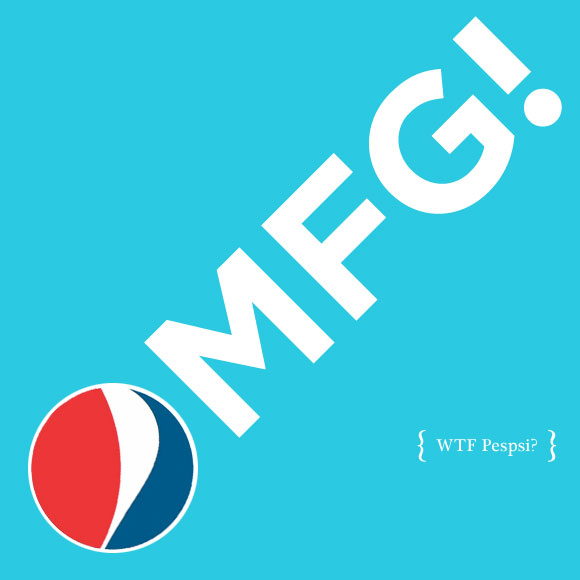
OMFG Pepsi!
Sorry if this is old news, but Pepsi has a lame extremely bland, ungraceful and nauseatingly vile new logo.
While described as a “smile” by Pepsi’s brand managers, to me the new logo looks like a muffin top. Pepsi’s old logo was at least stable and bold. The new one looks like a brain damaged designer on a short bus just randomly tweaked vertices. And there are three variations of this crap: little muffin top for Diet Pepsi, normal muffin top for regular, and big muffin for Max.
Looking at these logos on various blogs was bad enough, but when I came back to the States for the holidays many of the grocery stores were stocking the new packaging. There is something sinister in the shade of navy blue they chose for the cans and boxes. It almost looks like 2 liter bottles of NyQuil. The brown, 20 oz. bottles look like wrinkly dicks. The Pepsi logotype has a maddening “e” that ever so subtly references the old pepsi swirl.
The advertising introducing the new logo is eye-rolling. Outdoor ads plaster Dallas. Various optimistic words using the new logo as an “o” are set on a variety of flat vibrant backgrounds colors. HELLO, SODY POP, JOY, HOORAY, OH BOY!, ETC. You can get the general idea from the video at Pepsi’s Refresh Everything site. If these ads were in a student book of someone interviewing at an ad agency, I guarantee they would be laughed out the door. Instead, they are a campaign.
I’m all for change, but I wish Pepsi would have deliberated for more than 5 months before throwing out one of the few internationally recognized logos and instituted a worse version for hundreds of millions of dollars. Until the new logo gains traction, it appears like a knockoff. This is Chinese Pepso, or Cambodian Popsi, or Brazilian Pepsé. I shudder to think of all the table coverings, umbrellas, posters and signs that I saw for this swill in Thailand that will eventually replaced (and dumped) for this new logo.
Apparently, the new logo is the work of Arnell Group. If you like/dislike what you see, be sure to let them know.
There’s also been plenty of heated discussion, mostly negative, over the new Pepsi logo at Brand New.
Don’t get me started on the botched redesigns of Tropicana, Gatorade, Mountain Dew, and Sierra Mist.
Sigh.
15 Comments
Bob, as someone who disagrees with you, I disagree with your disagreement.
January 20th, 2009 at 7:41 pmnik, bob is wrong and you are right. that logo is ridiculously bad. reading your post was like reading my own words from back in october when i first saw that mess. i have a friend who works for pepsi and i sent him this long email which said so many of the exact same things you said here. i don’t even like pepsi, but i am still offended by the new, clumsy, ill-conceived logo(s).
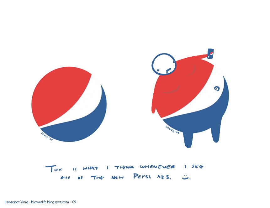
January 21st, 2009 at 11:37 ami saw a tv spot from pepsi last night. it was one of those like minute long music montage feel-good ads where it didn’t give away what it was pitching till the last 3 seconds or whatever. and i have to say, pretty well done. but whatever. the real reason i’m commenting again is to link to this funny, relevant, image:
http://www.suckatlife.com/images/pepsiLogoBlowatlife.jpg
I think the new pepsi logo is nice. I like it.
With their steps of “refreshing” the brand image… it’s very difficult to facelift the logo and at the same time to remain the same. The space for action is just too tiny :)
I wander what will be the next redesign after 6 years …
Logoblink, do you work for either Pepsi or Arnell?
March 7th, 2009 at 4:19 amYes. Their new logo is horrible. I actually am buying Coke now, just because I hate the logo.
March 16th, 2009 at 8:14 pmI agree. The new logo looks like the old logo melted.
March 30th, 2009 at 6:26 amIt’s supposed to be a smile? As in “Have a Coke and a smile”? So it’s not only lame, it’s based on a 30-year-old commercial by the primary competitor?
March 30th, 2009 at 8:24 amI totally agree. The new logo looks like cheap crap. I officially hate Pepsi now.
November 3rd, 2009 at 9:15 pmTHE LOGO IS AN ANGRY LEFT EYE. HOW CAN ANYONE NOT SEE IT?
LEFT = leftist president, left hand path, etc.
EYE = Eye of Horus, eye above the pyramid, all seeing eye, etc.
It is literally an EVIL EYE! Hiding in plain SIGHT.
Every time I see it, I know that I’m being given the stink eye by Pepsi Co. Like Obama himself is giving me the ol’ evil eye for not being politically correct enough.
Drink more Pepsi or “use racist”.
Fuck Coke and Fuck Pepsi. Take your fucking corn water and fucking choke on it. /oo\
August 19th, 2012 at 1:15 amI disagree also.
September 1st, 2012 at 2:32 pmit IS an obvious angry left eye. wake up and see it people. “Set is identified with all destruction. He is the waning of the moon, the decrease of the waters of the Nile, and the setting of the sun. Thus he was called the left or black eye.”
September 13th, 2013 at 3:44 pmPepsi’s new logo makes me think,
“Hey! They found a way to fuck up their image worse than NEW COKE!”
If corporate has ANY smarts at all, they will jettison that dogshit logo (it looks like it’s STONED!) as soon as possible, and publish a full-page apology in every major publication worldwide. The caption should say “We’re sober now…OUR BAD!”
Until then, I am more than happy to boycott Pepsi.
BAD MOVE, MORONS!!!
I was pondering this deeply the other night. Then, I was like, where is Google. Sure enough, somebody did an excellent article on the mystery of the new Pepsi logo. That logo looks like someone’s retarded little sister.
January 26th, 2019 at 9:45 am
As someone who needed a Hooray while driving down the highway today, I disagree completely. *sip*
January 20th, 2009 at 6:55 pm